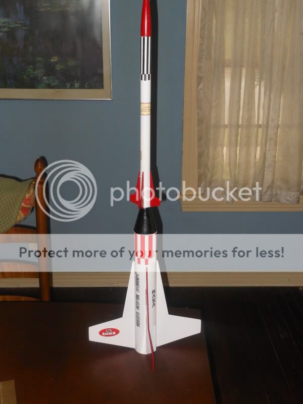
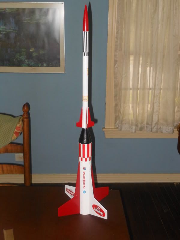
At long last the Laser-X is done.
The first photo shows the cause of a major detour. These are the Semroc furnished decals that came with the kit. You can see that the red color is pretty far from red - more like a brownish orange, and the black is not very saturated.
I put the decals and the model on my scanner to check the color components...the paint (Klass Kote red) is indeed a pretty pure red, while the decal is definitely orangey with excess green in it. So I resolved to make a new decal with better colors...needless to say this ended up being a fair amount of work over a few weeks. Real Life (tm) also intruded in the form of a new job so this wasn't a quick process.
A few things I learned while experimenting through half a dozen or so iterations of the decals:
Decal Media
I started with my supply of Bel inkjet decal paper, which is probably 4-5 years old now. After a couple of trial prints I found I wasn't getting very crisp images at all. Under magnification it looked very much like the ink was beading up on the media. Some sheets were worse than others but all of them had a somewhat mottled texture in the solid colors. I tried both the clear and white background media to no avail. The white background decal paper was actually much worse in this regard.
Ultimately I ordered some new and hopefully better media from Papilio. It gave amazingly better print quality with no hint of the ink beading problems. So I trashed all the Bel stuff and will stick with the Papilio going forward.
I should mention that this media is quite thin (1.5mil), flexible and stretchy, making it great for curved surfaces. However with minimal clear coat, the large roll pattern decals are actually too stretchy and become nearly impossible to apply without distorting. I found that you can control the elasticity by applying more clear coat (I used the Papilio UV resistant spray) - three or four medium coats will keep things more stable. Another thing that helped was to use warm water to make the decal release from the paper more quickly and completely.
Color Matching
On the first tries I followed the recommendation that comes with the decal media to use a "glossy photo paper" print profile. Oddly, the colors kept coming out much like the Semroc decal with the red shifting to a somewhat darker orange.
Finally I realized that the advice to use the photo paper profile is totally wrong. Reason? Inkjet photo papers have fluorescent white brighteners (FWB) in them. This makes the paper substrate a very bright white and increases the overall gamut (range) of colors that can be printed. However, clear decal media is transparent and has no brighteners whatsoever, though it does usually get applied over white paint. When you specify a glossy photo paper profile, the ink colors get adjusted to account for the FWBs, and the result is going to be way off.
Solution: you need to pick a print paper profile that doesn't assume an ultra-bright surface under the ink. I ended up getting the best results by actually using the "plain paper" setting at "high" print quality. This gave a good density in the black and red without any serious color shift.
Because I don't (yet) have a color calibrator, I also printed a test chart with various shades of red to compare against the actual paint. This let me get a pretty good match once I found the correct settings for the media profile.
Final Steps
After the decals went on, I gave the model a good coat of Blair clear gloss acrylic to seal them down (with the radiator/engine mount unit removed). Finally the tip probes were attached with Zap-a-Gap, using thin strips of blue tape to hold them in correct alignment.


")