Build Thread: Nibiru Interceptor

The Rocketry Forum

Help Support The Rocketry Forum:

This site may earn a commission from merchant affiliate links, including eBay, Amazon, and others.
Paint Evaluation

This really isn't a great paint job. There are a lot of spots that look beautiful and smooth and glossy, and others that are... not. It'll be fine, particularly from a few feet away, and *especially* if you don't run your hands over it and feel the roughness in spots.

paint.jpeg

It looks like I won't get to decals this weekend, still a few more issues to resolve. Will focus on the Angled Invader instead. I'm not used to working on two rockets at the same time....
 
Paint Evaluation

This really isn't a great paint job. There are a lot of spots that look beautiful and smooth and glossy, and others that are... not. It'll be fine, particularly from a few feet away, and *especially* if you don't run your hands over it and feel the roughness in spots.
That looks great Neil!

the bar continues to rise.

We have @cwbullet ’s 30 foot finish

@Ronz Rocketz 10 foot finish

@Nathan with the “as close as your eyeball can get, then use a magnifying glass” finish

Now we have the @neil_w “Palpable defect” finish.

How many rocketeers attend events where rockets are passed around and caressed? Usually the better the finish (like @Nathan ‘s birds) the more people say “don’t touch that! you’ll leave fingerprints.”

Something tells me the number of people who will SEE this rocket far outnumbers that of those who will actually HOLD the rocket.

This of course coming from me, the guy that rationalizes not using OpenRocket and is in fact jealous of those who can get a 10 foot finish.:( So please take this in fun. Probably explains why I stick so much to Helicopters, AirBrakes, Horizontal Spin (@Dotini still makes me look bad, both in the finishing and Flight departments ), BackSlide recoveries, where I can “fly naked” because “paint ways soooooo much!”
 
Does the ring go on before or after decals. What was @lakeroadster posting…. It don’t mean a thing if it ain’t got that ring”?
Could go either way. The ring should be installed before its own decals are applied, but it doesn't really affect much of anything on the rest of the rocket.

Now that you've got me thinking about it, maybe I'll do it before.
 
Installing the Ring

Now comes the very careful process of installing the ring, with goal #1 being to get it on straight.

I started by dry-fitting everything once more. The top piece was *very* tight sliding into the vertical stab (presumably due to the paint), so I did a bit more sanding of the slot to loosen it up a bit. This actually had no effect, and the insertion of the ring was a bit fraught, but it finally went in OK. The bottom ring was installed as well and I took a look:
bottom ring trim-1.jpeg
The bottom ring piece is just too long. Clearly, the pods ended up a bit lower than spec'ed in the design, for whatever reason. I trimmed the bottom piece down a bit (with scissors) until it looked like this:
bottom ring trim-2.jpeg
Now that is what I'm looking for. In addition to the two ring pieces almost (but not quite) touching, together they appear to form a perfect circle.

At this point I went to glue in the top piece with my SuperGold+, when I discovered that the bottle had completely gone bad. That is a bummer. I didn't have any other medium (gap-filling) CA on hand, so I decided to see if my thin CA would work. To my pleasant surprise it did; I applied a few coats at the seam with the vertical stab, and it looked good. I did where the ring entered the slots in the pods. I only applied the glue on the outside; I couldn't see any easy way to get it on the inside, at least not without some better CA nozzles. Also I'll definitely need some gap-filling glue for the insides. And so, gluing the inside is for future investigation. In the meantime, it's plenty solid with just the outside glued.

Next up: the bottom piece. I fiddled with it and looked at it many times to ensure it was straight, and applied the thin CA fillets as before. After a few coats it seemed very solid. Then, while inspecting it I realized I had never looked at it from the side before gluing...
ring-cockeyed.jpeg
It's a little hard to see in this picture, but the bottom ring piece is leaning a bit towards the front (left in this picture, and as a bonus it's ever so slightly in front of the top piece. This is a bummer but I'm not going to worry too much about it because this is not an angle that you'll ever be looking at the rocket, and from most other angles it looks fine. Still, it's funny how I just completely forgot to double-check it from the side when aligning it.

And so, the ring is in place. After all my initial hand-wringing about how to make this happen, my plan seems to have worked OK, while my fear about aligning the two pieces also appears to have been well-founded. Unfortunately there really is no obvious way to do it other than eyeball alignment, and it just needs to be done slightly better than I did it. But we move on.
 
Really looks great Neil.

How about some glamour shots of the entire rocket before addition of decals?

And maybe put the cockpit decals on first.... and then take some photo's of it in the raw too. Nibiru Interceptor, Skunk Works, Shake Down.
 
Decals, part 1

I linked previously to my experiments with decal paper for this build. For those that didn't follow that here's a summary:

I tested Koala decal paper that allegedly requires no clear-coat, even when printed with inkjet. Indeed, it works as advertised. However its finish is *extremely* matte, so much so that getting it to gloss up with Future is way too much work. So I clear-coated it with Krylon UV-resistant Clear... which seems to have made the black ink bleed a little where it meets the orange. Or, maybe the orange bled a little. I'm not sure. But it glossed up nicely, and I am using this batch of decals regardless.

Even clear-coated, the Koala paper gives a significant advantage relative to regular inkjet paper: the ink can go all the way to the edge and it won't run when soaked, period. I have had significant difficulty with this in the past with my white-backed decals.

Oh, I also have a sheet of clear-backed laser decals, for a grand total of 29 for this build.

The design has changed a bit from the original renders in the first post i this thread. For a change of pace, I have decided not to post the new renders. You'll see the design revealed as we go.

We'll start from the front. Coming up with a new and interesting (?) cockpit design for every sci-fi model is a challenge. For this one, @mbeels convinced me to go with dark windows, as opposed to my usual white. I think it was the right choice. Here's what it looks like:
decal_nose.jpeg
The frame around the windows is supposed to be matched to the paint color. I went through a stupid level of effort to try to achieve that. It looks good, but it's not nearly a match. Lesson: never depend on a perfect match to a paint color in your decals. Not worth the effort. Fortunately in this case it didn't really need to be a perfect match, but there are other situations where it might. Don't do it.

Sharp-eyed readers will note a paint defect in the bottom left of the picture. That was *supposed* to go under the decal, but somehow I lost track of it under the light while placing the decal, and once I found it again the decal was already in place. Oh well.

The canards get racing stripes to match the wings (top shown; bottom is the same) and then I added some, uh, cooling vent things because I needed something in that area.
decal_canards.jpeg

6 down, 23 to go.
 
Last edited:
BTW here are the finished decal sheets. Clear laser paper on left, Koala white paper (inkjet-printed) on right.

One extra of every decal is included, a good thing in this case because a few of the Koala decals were ruined by bad clear coat.
decal_sheet_clear.png decal_sheet_white.png
 
I find it adviseable to make extra decals when I print them out. Small ones that I'm fairly sure won't give any issues maybe an extra, larger ones, 2-3 extras. Uses more decal paper, but its rarely enough extra to require an extra page, and frankly trying to re-use that 1/3 or 1/2 sheet of decal paper is a pain in the butt.
 
Lesson: never depend on a perfect match to a paint color in your decals. Not worth the effort. Fortunately in this case it didn't really need to be a perfect match, but there are other situations where it might. Don't do it.

True, and in this case it fortunately looks like cockpit window framing. I think it works to your advantage in this case to add a slightly contrasting border.

1684765814518.png
 
True, and in this case it fortunately looks like cockpit window framing. I think it works to your advantage in this case to add a slightly contrasting border.
Definitely. For this design I didn't really need perfect match, which is a good thing because it seems like I never would have achieved it.
 
Sharp-eyed readers will note a paint defect in the bottom left of the picture. That was *supposed* to go under the decal, but somehow I lost track of it under the light while placing the decal, and once I found it again the decal was already in place.

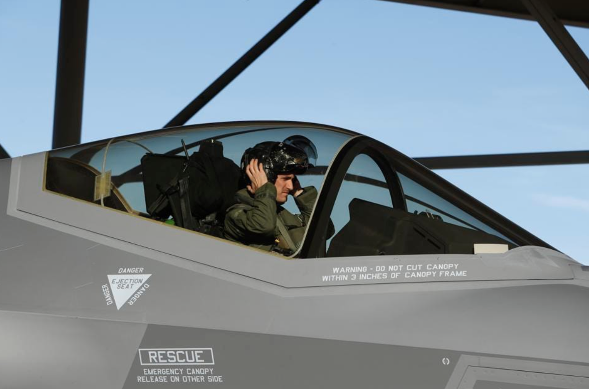
That area looks like a perfect place to put the ejection warning marker that seems ubiquitous on modern fighters in this century.


The Niburans may have transporter beams sort of like when the enterprise beamed the pilot out of his fighter just before the tractor beam crushed it in the original series.

Anyway, you can put the words in Niburan, nobody will know whether it says “eject” or is a Niburan epithet regarding the parenthood of their Qikasan enemies.

Or you can put a few Qikasan flags there to imply your pilot has shot down a few of those dastardly Qiks (hopefully the moderators don’t get on my case for discrimination, I just don’t like the Qiks.). Plus the Niburans make better food, it’s kind of a cross between Thai and Vietnamese, but it’s been a while since I tried it. The desserts are out of this world!

Regarding color matching, I was looking at the picture (BEFORE I read your comments) and thought, “Wow, he really nailed the color match!” When I first saw the decal sheet I didn’t even realize you were trying for a color match.
6285527eb270c.image.png


Now that I look at it, the “real” fighter has a slight contrasting trim outlining the canopy, so absence of a perfect match actually makes it more “realistic” (I.e. , call it a “win” and move on.)
 
Last edited:
Definitely. For this design I didn't really need perfect match, which is a good thing because it seems like I never would have achieved it.

Well neil_w and @BABAR , you know what they say:

"Trying to match paint to decals is like trying to teach a pig to sing. It frustrates you and annoys the pig."
 
Decals, part 2

Moving back on the airframe, I added a cluster of decals inspired by some from the Interceptor. They are.... some kind of access panels or something? I have no idea. Oh, and a stripe, *that* I know about.
decal_middle-2.jpeg

decal_middle.jpeg

The large one on the left came out a millimeter or so too large... I had to trim it really tight to fit it above the pod support fine. It *just* fit, with zero mm to spare.

9 down, 20 to go.

Conveniently, this cluster of decals obscures a pucker in the body tube where the front centering ring is (the first time I have encountered this.) For some reason it is only visible (barely) in the front beauty shot posted earlier:
1684890884805.png
It's readily visible in person, or at least it was until it got covered with decals.

So don't let anyone ever tell you that wood glue is the only kind that shrinks and puckers around a centering ring; good old Elmer's Glue-All does as well. For perfect motor mount insertion, epoxy is the way to go: no grab and no shrink. It's just less convenient.
 
Last edited:
Decals, part 3

Finishing up the airframe/fuselage/whatever you want to call it: more Interceptor-inspired touches. These are some sort of vent, please don't ask me to explain it any further. Once goes on each side of the vertical stab:
decal_vents.jpeg

And one, ever-so-slightly larger, goes on the bottom.
decal_vents-2.jpeg

This completes the fuselage. Onto the pods.

12 down, 17 to go.
 
So don't let anyone ever tell you that wood glue is the only kind that shrinks and puckers around a centering ring; good old Elmer's Glue-All does as well. For perfect motor mount insertion, epoxy is the way to go: no grab and no shrink. It's just less convenient.
Water based PVA either way.
 
Water based PVA either way.
Yup. I feel like in the past, wood glue has been singled out as the cause of the pucker, and it seems to have a worse reputation for shrinkage than white glue. But I'm not sure there's any difference in that regard. There are plenty of other differences of course.
 
Wing Decals, part 1

These are unchanged from the original concept. Top view:
wing-decals-top.jpeg
Bottom view:
wing-decals-bottom.jpeg

The clear-coated Koala decals are very well-behaved. Predictable release, thick enough that they're not super-finicky, and absolutely no ink leakage at the edges. Although they are a bit weird, they are probably my go-to in the future for white-backed decals. For clear.... well I'm not sure yet.

16 down, 13 to go.
 
More Decals: Wings part 2 and Vertical Stabilizer

The second layer of decals on the wings is the aileron lines. They're not very realistic but they still look good IMHO (at least, better than without them.)
wing-decals-2.jpeg
Once again, bottom looks the same.

The vertical stabilizer is not very inspired but does the job.
decal-stab.jpeg

22 down, 7 to go. Getting there!
 
More Decals: Wings part 2 and Vertical Stabilizer

The second layer of decals on the wings is the aileron lines. They're not very realistic but they still look good IMHO (at least, better than without them.)
View attachment 582989
Once again, bottom looks the same.

The vertical stabilizer is not very inspired but does the job.
View attachment 582990

22 down, 7 to go. Getting there!
Any significance to the number 58? At least it’s not 42.
 
Any significance to the number 58? At least it’s not 42.
I recall you've put your age on one before, and if memory serves that should be about right. Is that it again? NIX might be your initials, except that they're not. Someone else's? Or you're about to, or just did turn 59, so 58 will be or has been "nixed"?
 
I recall you've put your age on one before, and if memory serves that should be about right. Is that it again?
Correct. I am nothing if not predictable.
NIX might be your initials, except that they're not. Someone else's? Or you're about to, or just did turn 59, so 58 will be or has been "nixed"?
Sorry, *that* I simply refuse to explain. Thou art overthinking.
 
Back
Top