Neil_W's half-baked design thread

The Rocketry Forum

Help Support The Rocketry Forum:

This site may earn a commission from merchant affiliate links, including eBay, Amazon, and others.
The purple triangles make it look like diamond cutter, and the white background is just similar to PDII
Totally agree on first point, those are gone. Mostly agree on second point as well. Could be Joe's suggestion of subbing in silver instead of the white might differentiate it a bit.

I didn't love Gary's original green theme, although I've stared at it long enough that it's gonna take me a little while to get it completely out of my system.
 
Gonna try some different things. I think the purple (though cool) isn't sufficiently different from PD2. Also, it's dark enough that it doesn't contrast the black as much as I'd like. So here it is with nothing changed other than purple -> green. I think it already has a very different (and better) character to it. There are more changes coming, although I don't know exactly what they are yet. :)

upload_2019-11-11_9-3-38.png
 
That's a tough call. I do thinking cleaning up the fin can helped. I like the brighter color of the green, but I also really like the purple. The purple looks more "coherent" (I'm lacking a proper word).
 
That's a tough call. I do thinking cleaning up the fin can helped. I like the brighter color of the green, but I also really like the purple. The purple looks more "coherent" (I'm lacking a proper word).
I do like the purple, but I think I like the contrastiness of the green, also it's a bit of a glowier color, works better for plasma. The silver I'm not yet convinced about.

Oh hey, here's a version where plasma = surface of the sun (back to white for the background):
upload_2019-11-11_9-57-5.png

Bear with me while I mess around with this stuff for a while.
 
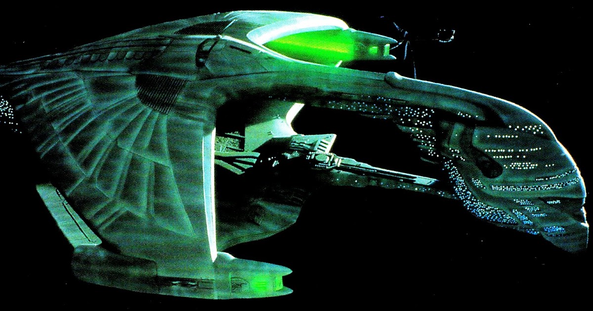
Green plasma, imho, beats both the purple and the orange. In general I like purple and black, but you're right about the lack of contrast.

White looks better than the gray stand-in for silver, but I still think it would look great with metallic silver paint. And better yet with actual metal, like aluminum foil bonded shiny side out, or silver leaf.

I'm trying to come up with a backstory for the colors. The "original" Plasma Dart had a large plasma core with the radiation spectrum of recombination in the green wavelengths; its "replacement", Plasma Dart II, has a more compact core which still provides all the energy needed by operating in higher energy states, hence the shorter wavelength of its radiated light. That story works better if PD has an orange core since there's more difference in wavelength from orange to blue than from green to blue. But I think the green looks better.
 
White looks better than the gray stand-in for silver, but I still think it would look great with metallic silver paint. And better yet with actual metal, like aluminum foil bonded shiny side out, or silver leaf.
That's actually a silver texture that I've used before, but being a simple flat texture it doesn't reflect and scatter that light the way real silver paint does (and there's no way to do that in OR).

Silver paint is nice, but I'm finding that I like the white/green/black combination (and as a bonus, I don't have a rocket with that color combo right now. Diamond Cutter is green/black/silver).

I'm trying to come up with a backstory for the colors. The "original" Plasma Dart had a large plasma core with the radiation spectrum of recombination in the green wavelengths; its "replacement", Plasma Dart II, has a more compact core which still provides all the energy needed by operating in higher energy states, hence the shorter wavelength of its radiated light. That story works better if PD has an orange core since there's more difference in wavelength from orange to blue than from green to blue. But I think the green looks better.
Go for it, but as I said this one is sport rocket all the way. Beyond the simple existence of what we're calling the plasma core, I'm not looking for any sort of sci-fi justification, just plain old good looks. :)
 
What say you all to the idea of the white dorsal fin? (note the decals on the all the fins are still subject to change, so try to exclude the decals from your consideration).

A single different-colored fin seems like a pretty common design element; I don't believe I have a single rocket that incorporates it.
 
Oh hey, here's a version where plasma = surface of the sun (back to white for the background):
This concurs with the plasma discharge from the TOS Romulan War Bird:
plasma-torpedo-balanceofterror.jpg


What say you all to the idea of the white dorsal fin?
+1
 
I still like the neon blue.
I think you need a contrast color (white or silver) very thin band at the plasma compartment/black transition interfaces.
I don’t think you should use the plasma pattern anywhere else on the rocket, limit it to the plasma core.

Maybe put some Klingon or Kilrathi symbols on the fins (alien language numbers) or Radiation Warning symbols on them.
 
More opinions incoming:
  • I like white over silver
  • I like the single white fin.
  • I agree with BABAR, keep the plasma texture in the plasma core, but use the plasma color elsewhere.
  • As for colors, hard to say! I like the last one I looked at best....
 
I think you need a contrast color (white or silver) very thin band at the plasma compartment/black transition interfaces.
Hmm, interesting. I'll experiment.
I agree with BABAR, keep the plasma texture in the plasma core, but use the plasma color elsewhere.
That's what I did on PDII... @Nytrunner still hasn't forgiven me. :)

I'll see on this one. I do believe in using the plasma texture judiciously outside the core, but since this is a non-scifi model I don't feel constrained to avoiding it completely.

I'm gonna go with black/white/green for now. Can still change later if necessary.

One thing I just noticed: on Gary's old color scheme, the strakes were light colored. I think I like them better in black. There is still perhaps an opportunity to put a decal on the "canards" (the sticky-outy bits at the front of the strakes) to make them stand out a bit.
 
Green might work better with a mostly black background. It doesn’t “pop” with the overall white background paint scheme.

Maybe reverse all the current black to white and white to black
 
Last edited:
Hmm, I am not seeing the lack of pop.

I did realize I have *two* rockets that are predominantly black with green highlights... gotta keep this different. Also, once I have the *design* nailed down (although it never really is), I'll be able to try out different colors relatively easily. I could easily see going back to a red/orange plasma, just to be more different from my other rockets. Still working on the design, I think it's getting better. Will post a new image soon.
 
I like the red-orange. I like the green better, but if you want to avoid green for the sake of variety in your fleet, you won't go wrong.

On the nose, the little bits of plasma pattern are lost with the black triangles on top of them. It might be sufficient to flip the plasma patterns around so there's color directly adjacent to the black. Probably better would be to use the plasma all the way through the triangles.

But then, on the other hand, you might go a whole different way. Another option would be to not use the plasma patter except on the core. I know you're not going for any sci-fi logic, but hear me out. It looks to me like repeating the plasma pattern in those little stripes on the fins and nose is detracting from the core itself. In other words, the core should be the star of the show, and repeating its pattern elsewhere waters down its impact. Plain black for the other features would work, or a metal (no, I won't get over it :D) or fire engine red, or something.
 
Oh yeah. That is my favorite so far, by a large margin. I like the faded textures on the nose cone, and faded texture on the fins with bands. Build it!
 
I'm not usually one to make aesthetics suggestions, so take with a block of salt...

The fade to white on the nose cone plasma stripes seems a little incongruous to me since you have the full plasma forward and aft. Would it make sense to bring those stripes back to the widest point of the transition and have them end against the black with no fade? I think the forward fade to black looks good, though that could happen on the transition or on the forward body tube as you have it.

For the fins, I might choose the most saturated orange in the plasma and just have solid color stripes. Or at least see how that looks.
 
Oh yeah. That is my favorite so far, by a large margin. I like the faded textures on the nose cone, and faded texture on the fins with bands. Build it!
Still two other builds in front of it... ;)

Nice to get this one closer to ready, though. I'll still fiddle with it some more, but if I had to do it just like this I'd be happy. Oh, and a bonus: this is a comparatively easy mask and paint job.
 
I'm not usually one to make aesthetics suggestions, so take with a block of salt...
All suggestions are welcome. I don't take every suggestion but I consider them all.

However...
The fade to white on the nose cone plasma stripes seems a little incongruous to me since you have the full plasma forward and aft. Would it make sense to bring those stripes back to the widest point of the transition and have them end against the black with no fade? I think the forward fade to black looks good, though that could happen on the transition or on the forward body tube as you have it.
I'm not at all sure of what you're saying in any part of this. Do you mean to have the payload section stripes go all the way through the payload section and up the transition?

For the fins, I might choose the most saturated orange in the plasma and just have solid color stripes. Or at least see how that looks.
I can play with that. Right now they are a double-fade, starting as white (or black), fading to plasma, then fading out.
 
I will not make the mistake I made with PDII of building too small. This one will be sized for D/E/F44.
So, 24 mm MMT. What is the size of the rest? If you've said I have forgotten.

Maybe I'll fiddle around with a related design, Plasma Cruiser. Would you send me that plasma pattern?
 
So, 24 mm MMT. What is the size of the rest? If you've said I have forgotten.
Two sizes both end up well-suited for 24mm, but I'm going with the slightly larger one, which is: BT60 in front, BT55 in the core, and BT70 in the fin can. Comes out around 32" total. It might actually lose an inch or two because of nose cone availability issues (that is, I might need to go with the same shorter nose cone I used in Diamond Cutter and will be using in the Skywriter).
 
I'm not at all sure of what you're saying in any part of this... Right now they are a double-fade, starting as white (or black), fading to plasma, then fading out.
I think it's the fade to white at the aft end of the nose stripes that boatgeek was talking about. And his suggestion, if I read him right, is to extend those stripes aft all the way up the first transition to the edge of the black reducing transition, and fade to black when you get close.

Adding my 2¢ to his if you do that, you could extend the forward ends of those stripes into the triangles and fade to white as they thin down to their points.
 
I'm not at all sure of what you're saying in any part of this. Do you mean to have the payload section stripes go all the way through the payload section and up the transition?

Yes, that's what I was thinking. The stripes would start at the transition where the strakes end and go forward some distance. The plasma might end on the transition itself, or it might continue forward similar to what you have here. If the plasma ended on the transition, I think you would still want the black stripes going forward to the nose cone like you have now.
 
Here's the stubbier nose cone:
upload_2019-11-12_16-20-58.png

Not as nice, but it's the only conical BT60 nose Balsa Machining sells, and it's half the price of the longer ones sold by eRockets. Hmm.
 
Back
Top